Ready Containment
Recalibrating a Florida-based Military Supplier to compete with strength.
Florida based company Ready Containment reached out to Lythouse to recalibrate their brand identity as well as overhaul their eCommerce journey. We reviewed the needs of the project and devised a strategy to transform the business.
Brand
Building a Military-grade brand identity for mass consumer appeal.
We wanted to revision the current identity, adding subtle military cues whilst staying universal for the mass market. We came up with a brand that resonated the ready-to-go goal of their products with the addition of design elements inspired by military objects. The new brand colour palette stayed true to their current identity (blue) whilst extending the capabilities, giving the brand much more visual presence. The colours were selected to resonate the military theme and provide more variety, adding a bright accent colour to be used as a call to action for the eCommerce journey.
Brand Strategy
Our brand strategy concluded a revision was needed to bring the brand into the 21st century. Our aim was to revitalise the brand but evolve some of the existing branding that build their success over 20 years.
Logo Design
We designed a logo that captured the Military capabilities of the brand without being too cliché. We added dynamic accents to the wordmark to reaffirm the “ready” nature of the products with a chequered flag like reference. A dog tag shape referenced the Military offering with a subtle connotation.
Typography System
Lythouse setup an strong yet accessible typography system that was implemented on the website.
Colour Palette
The colour palette was inspired by the Military roots. Combining new colours that reflected the military offering with existing brand-relevant blues that were given a modern vibrancy. We implemented a new accent colour that would be used to grasp attention for marketing and call to actions onsite.
Brand Elements
To celebrate the 20th Anniversary of the company, we were tasked to come up with artwork to attribute to that. We created a badge that showcased the milestone which was used for limited run workwear.
Branded Workwear
We implemented our new 20th year anniversary branding elements onto a limited run of workwear, starting with baseball caps (hats) to protect from the hot Florida sun.
Website


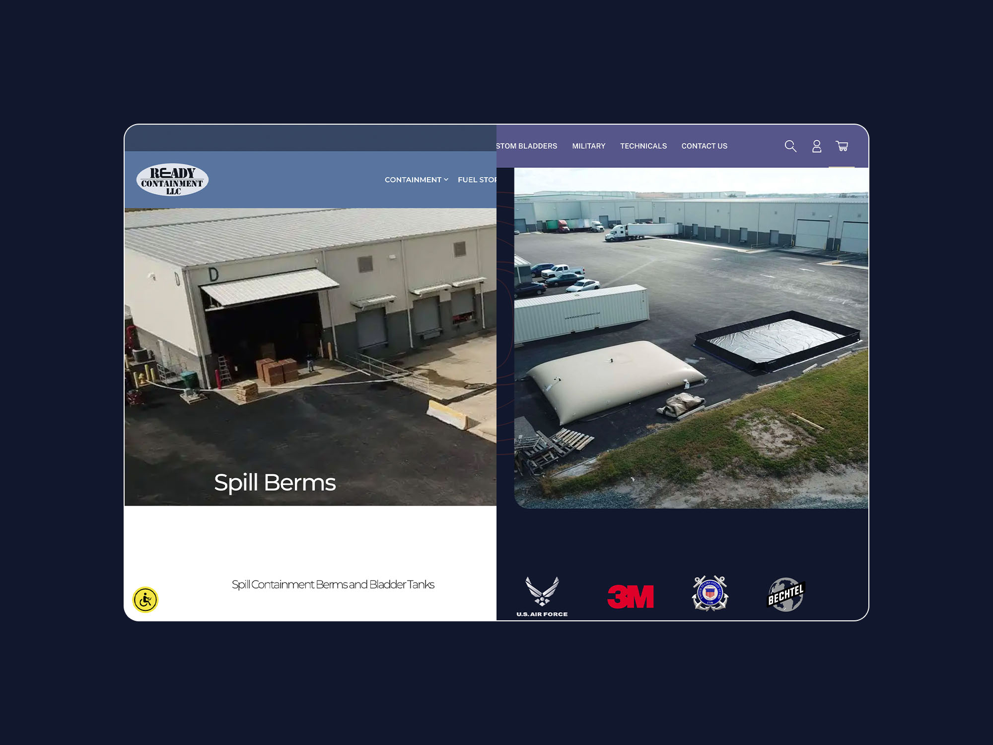
A bespoke eCommerce store to optimise conversion with improved UX & navigation.
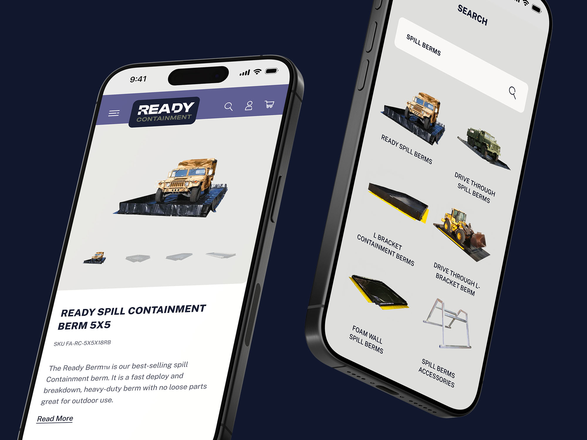
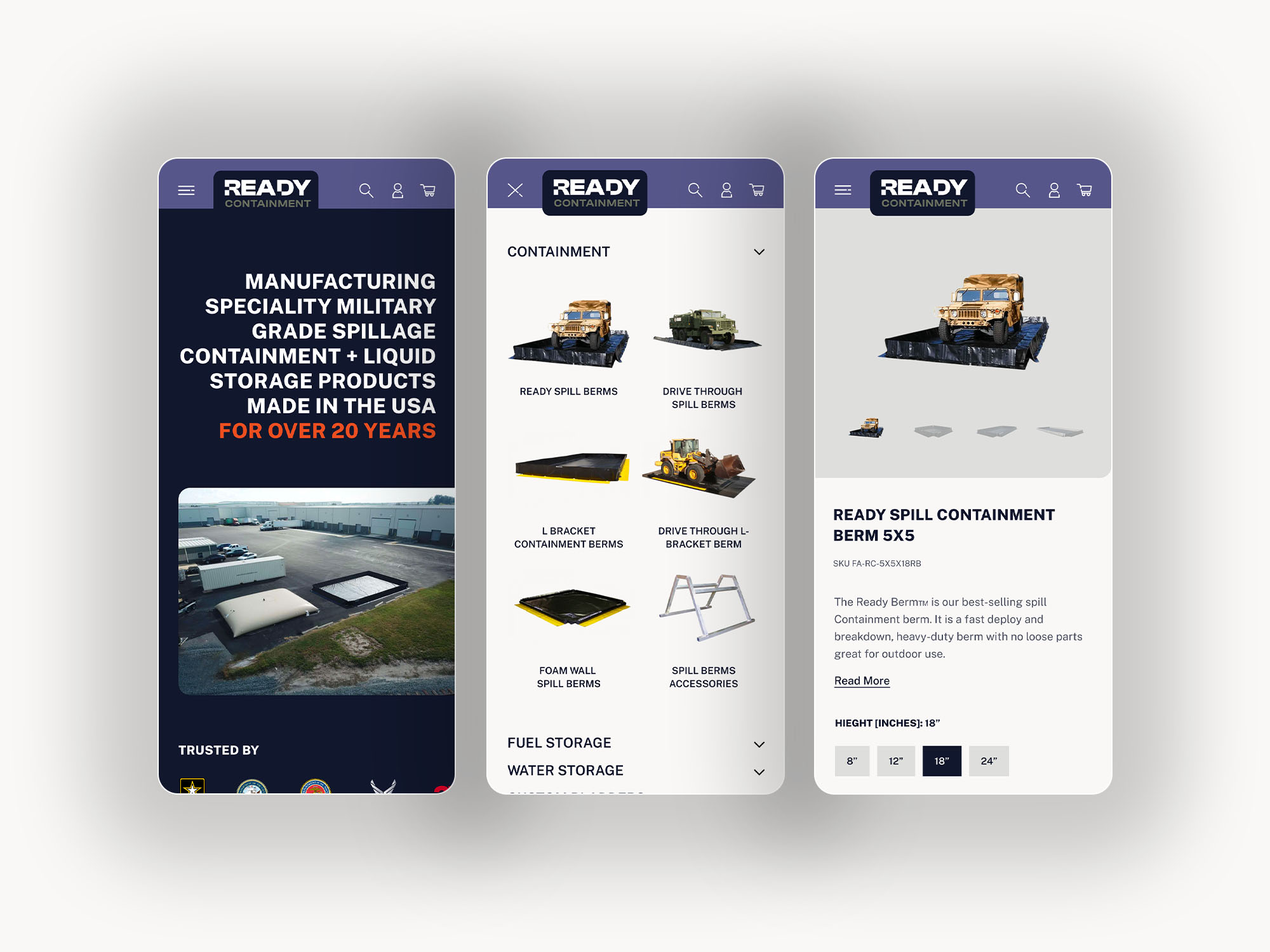
Our digital strategy looked to improve the sites UX, implementing best practices for conversion rate optimisation (CRO). Lythouse aimed to provide users with a clear sitewide navigation and quick linking to the products. With a large and complicated range of products we needed to distill the offering into manageable chunks of information. As well as a wide array of products, there was also a large amount of product options to consider. Therefore, we implemented product listing pages to ease product filtering with enhanced product attribute filters.
Digital Strategy
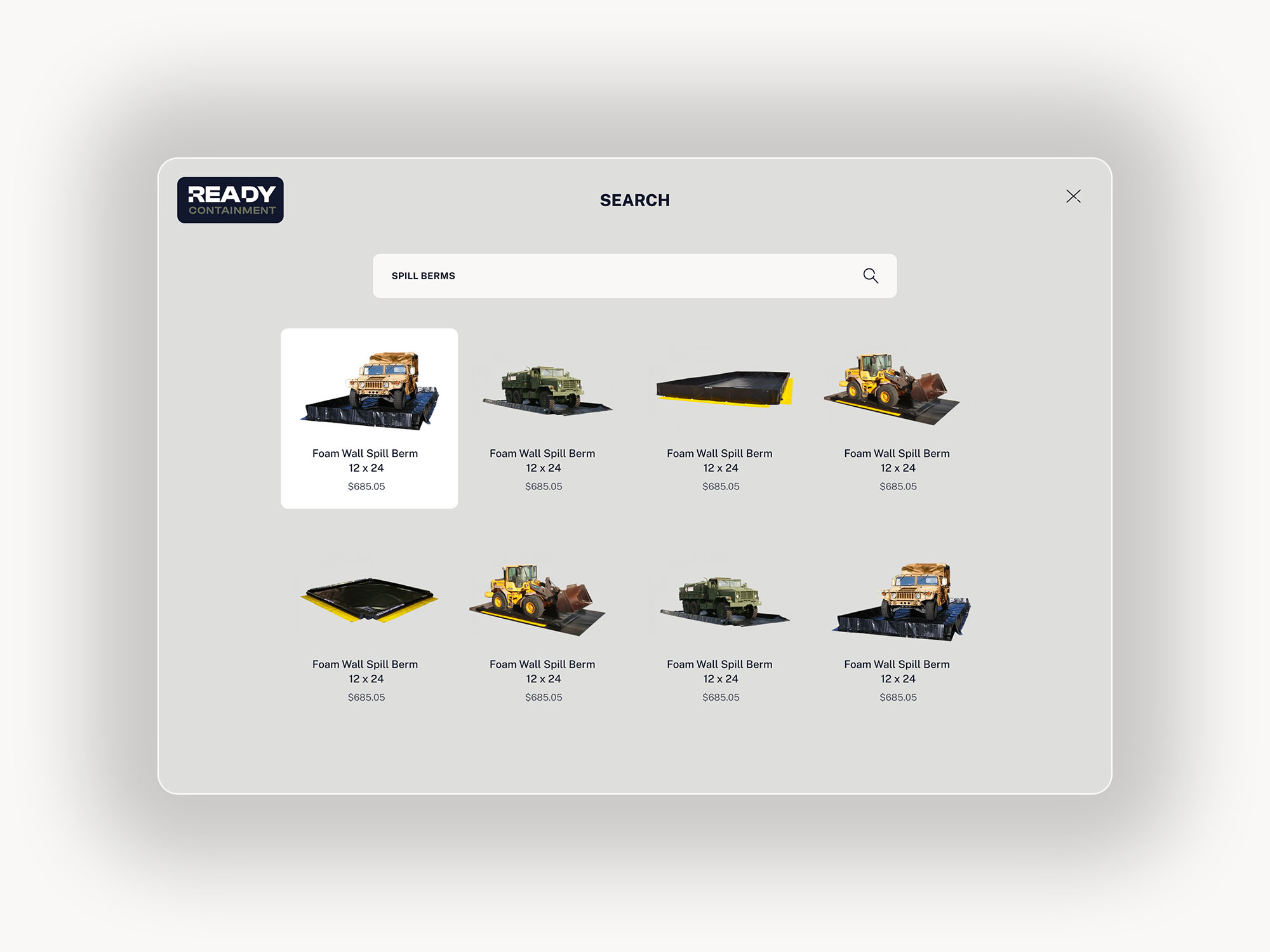
We devised a digital strategy to maximise conversion online and provide a clear journey for the users. We called upon our eCommerce expertise to optimise the sites and business goals to purchase without pain. The current site was missing a search function, one of the essentials of an eCommerce store.
Improved UX
We revised the user experience of the site, giving importance to the customer journey to purchase. We implemented inline search functionality to provide a seamless search experience – a vast improvement considering search was missing altogether on the current site.
Website UI Design
Lythouse created a bespoke UI that perfectly extended our fresh new branding. We implemented a visual hierarchy that worked harmoniously with image content. The website UI captures the essence of the brand and diversifies the visual language to improve user engagement. Lythouse believe a good product should look great as well as function.
Wordpress Development
In pixel-perfect fashion we translated our bespoke UI onto our choice CMS, Wordpress. We implemented responsive development of the site, maintaining the focus on usability and the consumer journey. Integrated with the eCommerce functionality of WooCommerce, we were able to deliver a website that functioned as well as it looked.
Enhanced product filters
In order to distill the product offering, we strategised enhanced product filtering to combat the vast array of product options and make it easier for consumers to filter directly to their needs.
Usability Testing
We conducted Usability Testing to confirm our UX fixes inline with the goals set out. As the new improved functionality was strategised through our user experience research we wanted to confirm we were on track with the outcome.
We were thrilled with the outcome of this project, from the branding to restructured UX & complimentary UI – Lythouse delivered the goods. Our work brings the brand into the 21st century with carefully-considered design.